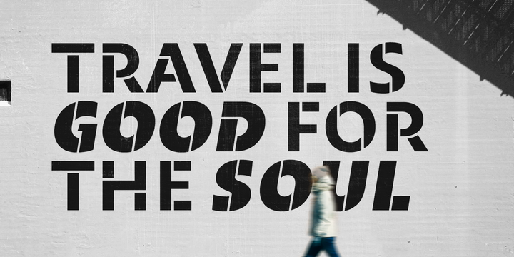
Maipo Sans is a modern typeface inspired by the mountain landscape of Cajón del Maipo, Chile. Its
forms are inspired by the first sans serif European Humanist fonts of the twentieth century along with a touch of reverse contrast. This typeface is specially designed for projects using extensive text blocks and striking ads.
Maipo Sans puts a careful focus in the interpolation; therefore it gains expressiveness as its weight
increases. That is why it has moderate and functional forms in its thinner weights, while in his heavier variants it gains freshness and sympathy.
To make it more complete, this family has a complete Stencil Version with a lot of character and power.
Maipos Sans is composed by 40 styles, 826 glyphs and Small Caps.
Besides, it has powerful OpenType features for each style, including stylistic sets, extended language
support, ligatures, contextual alternates, lining figures, oldstyle figures, arrows, fractions,
superscripts, subscripts and many more.

